Chapter 1: Exploring Data
Q T1.3.
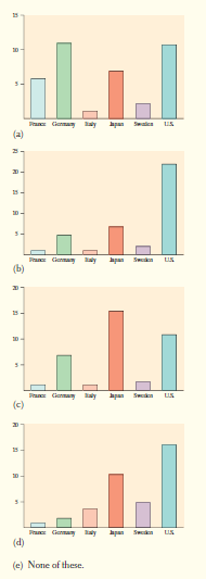
Which of the following bar graphs is equivalent to the pie chart in Question T1.2?
Q T1.5.
The percentage of students with less than $10 in their possession is closest to
(a) 30%. (b) 35%. (c) 50%. (d) 60%. (e) 70%
Q T1.6.
Which of the following statements about this distribution is not correct?
(a) The histogram is right-skewed.
(b) The median is less than
(c) The IQR is
(d) The mean is greater than the median.
(e) The histogram is unimodal.
Q T1.7.
Forty students took a statistics examination having a maximum of points. The score distribution is given in the following stem-and-leaf plot:
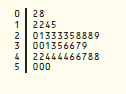
The third quartile of the score distribution is equal to
Q T1.8.
The mean salary of all female workers is The mean salary of all male workers is What must be true about the mean salary of all workers?
(a) It must be
(b) It must be larger than the median salary.
(c) It could be any number between and
(d) It must be larger than
(e) It cannot be larger than
Q T1.9.
A survey was designed to study how business operations vary according to their size. Companies were classified as small, medium, or large. Questionnaires were sent to randomly selected businesses of each size. Since not all questionnaires in a survey of this type are returned, researchers decided to investigate the relationship between the response rate and the size of the business. The data are given in the following two-way table.
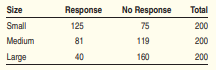
What percent of all small companies receiving questionnaires responded?
