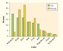
Chapter 1: Q T1.3. (page 78)
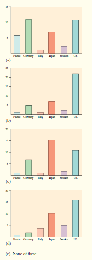
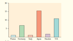
Which of the following bar graphs is equivalent to the pie chart in Question T1.2?
Short Answer
Expert verified
The correct option is (b)
Step by step solution
01
Given information
Given:


02
Concept
A statistical graph or chart is a visual representation of statistical data in graphical form.
03
Explanation
In a pie chart, the United States takes up the most space, and in a bar graph, the bar above the United States shows the highest percentage. In both pie charts and bar graphs, the other five countries have a similar distribution.


In the provided question, the (b) Bar graph appears to be equivalent to the pie chart. Thus, option (b) is correct.
Over 30 million students worldwide already upgrade their learning with ��Ӱֱ��!