/*! This file is auto-generated */ .wp-block-button__link{color:#fff;background-color:#32373c;border-radius:9999px;box-shadow:none;text-decoration:none;padding:calc(.667em + 2px) calc(1.333em + 2px);font-size:1.125em}.wp-block-file__button{background:#32373c;color:#fff;text-decoration:none} Q 12. Deaths among young people Among ... [FREE SOLUTION] | ÷ÈÓ°Ö±²¥

÷ÈÓ°Ö±²¥

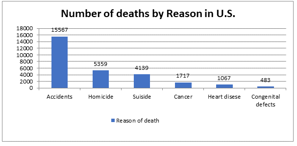
Deaths among young people Among persons aged 15to 24years in the United States, the leading causes of death and number of deaths in a recent year were
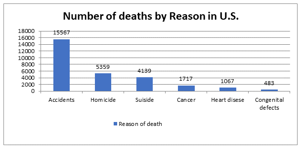
as follows: accidents, 15,567; homicide, 5359; suicide, 4139; cancer, 1717; heart disease, 1067; congenital defects, 483

(a) Make a bar graph to display these data.

(b) To make a pie chart, you need one additional piece of information. What is it?

Short Answer

Expert verified

Part (b) Aside from the listed reasons, the additional information needed to make a pie chart includes the number of fatalities in the previous year in the United States, as well as the count of deaths owing to other causes.

Part (a)The pie chart is

Step by step solution

01

Part (a) Step 1: Given Information

According to the data, the table is drawn below:

Reasons of death numberNumber of death accidents
Accidents15567
Homicide5359
Suicide4139
Cancer1717
Heart disease1067
Congenital defects483
02

Part (a) Step 2: Concept

The distribution of a category variable is displayed using pie charts and bar graphs. Any set of quantities measured in the same units can be compared using bar graphs. It's a good idea to ask yourself, "What do I see?" when looking at any graph.

03

Part (a) Step 3: Explanation

The above information is listed in the following table.

Reason of deathNumber of deaths
Accidents15567
Homicide5359
Suicide4139
Cancer1717
Heart disease1067
Congenital defects483

The bar chart is drawn in excel by selecting the two columns of the above table.

04

Part (b) Step 1: Explanation

When a phenomenon is separated into sub-events, a pie chart is utilized. The overall number of deaths is separated into deaths due to various causes such as accidents, heart diseases, homicide, suicide, and congenital problems, however, there is no information on the total number of deaths in the previous year. The information on this yields deaths due to other causes, which aren't included in the data.

Unlock Step-by-Step Solutions & Ace Your Exams!

  • Full Textbook Solutions

    Get detailed explanations and key concepts

  • Unlimited Al creation

    Al flashcards, explanations, exams and more...

  • Ads-free access

    To over 500 millions flashcards

  • Money-back guarantee

    We refund you if you fail your exam.

Over 30 million students worldwide already upgrade their learning with ÷ÈÓ°Ö±²¥!

One App. One Place for Learning.

All the tools & learning materials you need for study success - in one app.

Get started for free

Most popular questions from this chapter

Use the data in the two-way table on page 12 to calculate the marginal distribution (in percents) of gender.

The audience for movies Here are data on the percent of people in several age groups who attended a movie in the past 12months:

(a) Display these data in a bar graph. Describe what you see.

(b) Would it be correct to make a pie chart of these data? Why or why not?

(c) A movie studio wants to know what percent of the total audience for movies is 18to 24years old. Explain why these data do not answer this question.

Age groupMovie attendence
18 to 24 years83%
25 to 34 years73%
35 to 44 years
68%
45 to 54 years
60%
55 to 64 years
47%
65 to 74 years
32%
75 to and over
20%

Shopping spree A marketing consultant observed 50 consecutive shoppers at a supermarket. One variable of interest was how much each shopper spent in the store. Here are the data (in dollars), arranged in

increasing order:

(a) Round each amount to the nearest dollar. Then make a stem 50plot using tens of dollars as the stems and dollars as the leaves.

(b) Make another stem plot of the data by splitting stems. Which of the plots shows the shape of the distribution better?

(c) Write a few sentences describing the amount of money spent by shoppers at this supermarket.

Baseball paradox Most baseball hitters perform differently against right-handed and left-handed pitching. Consider two players, Joe and Moe, both of whom bat right-handed. The table below records their performance against right-handed and left-handed pitchers:

(a) Use these data to make a two-way table of player (Joe or Moe) versus outcome (hit or no hit).

(b) Show that Simpson’s paradox holds: one player has a higher overall batting average, but the other player hits better against both left-handed and right-handed pitching.

(c) The manager doesn’t believe that one player can hit better against both left-handers and right-handers yet have a lower overall batting average. Explain in

simple language why this happens to Joe and Moe.

Researchers from Amherst College studied the relationship between varieties of the tropical flower Heliconia on the island of Dominica and the different species of hummingbirds that fertilize the flowers.45 Over time, the researchers believe, the lengths of the flowers and the forms of the hummingbirds’ beaks have evolved to match each other. If that is true, flower varieties fertilized by different hummingbird species should have distinct distributions of length. The table below gives length measurements (in millimeters) for samples of three varieties of Heliconia, each fertilized by a different species of hummingbird. Do these data support the researchers’ belief? Follow the four-step process

See all solutions

Recommended explanations on Math Textbooks

View all explanations

What do you think about this solution?

We value your feedback to improve our textbook solutions.

Study anywhere. Anytime. Across all devices.